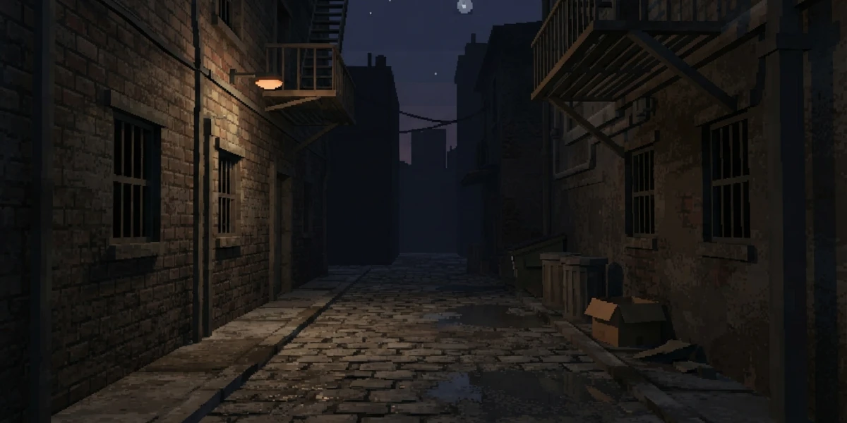
Image generated with AI
Retro 3D Aesthetics: PS1 Look and Pixel Art in Blender

Diego Cortés
Author
A polygon edge that trembles, a texture that swims as the camera moves and colors that never quite blend. The PS1 style in Blender is not nostalgia: it is a short list of technical decisions you can reproduce today, step by step, with concrete switches.
What Defines the PS1 Style in Blender (and Why Lower Resolution Is Not Enough)
The PS1 look is not a filter you apply at the end: it is what you see when the hardware is severely limited. The original console ran a 33.8688 MHz CPU with a geometry coprocessor, the GTE, working in integer arithmetic with no floating-point unit. Positions were rounded to whole numbers and vertices jumped a pixel at a time as the camera moved: the wobble was not a style, it was math.
Its GPU drew primitives into the framebuffer with no Z-buffer: depth was the processor's problem and the programmer's, with 1 MB of VRAM for framebuffer and textures, output from 256x224 to 640x480, and affine texture mapping, which interpolated UVs in screen space instead of correcting for perspective. Out of that come the three signatures we are chasing: big pixels and hard edges, pocket-sized unfiltered textures, and short palettes with dithering over simple geometry.
Step 1: Set the Resolution and Turn Anti-Aliasing Off
Resolution and Percentage
Under Output Properties, on the Format tab, you have Resolution X/Y and a Percentage value that scales the render relative to it. Work with old television proportions and remember that Aspect X/Y exists for non-square pixels. Lock the resolution before you model: a low resolution forgives geometry and punishes fine detail.
Anti-Aliasing in EEVEE, Cycles and Workbench
In EEVEE, the film options have Filter Size: the manual explains that these filters exist to avoid aliasing, so low values give a crisper render. In Cycles, the Pixel Filter offers Type (Box, which applies no filtering; Gaussian; Blackman-Harris, the default) and Width: lower is sharper. And for the hardest look there is Workbench, with sampling set to No Anti-Aliasing.
The Pixelate Node
In the Compositor, the Pixelate node reduces detail by making individual pixels more prominent, with a single control: Size. It is how you decide that one real pixel measures three or four pixels in the final image, with no half pixels left over. It works as the last link in the chain (see render passes and AOVs).
Step 2: Pocket-Sized, Unfiltered Textures
Nearest Interpolation
This is the key switch. In the Image Texture node, Nearest interpolation does not interpolate at all: it takes the closest texel, and the manual describes it as useful for pixel art. The effect is the familiar one: the texture looks blocky up close and shimmers at a distance, because there are no mipmaps. What would be a defect in a modern render is the signature here.
256 px Textures and Few Colors
Work at powers of two (64, 128, 256), paint by hand and export with short palettes; the painting side is covered in texture painting. To understand what each map does inside a material, shader nodes are the foundation.
Step 3: Short Palettes and Dithering
Posterize and Constant Ramps
Two Compositor nodes do the work. Posterize reduces the number of colors and turns smooth gradients into hard transitions: its Steps control sets colors per channel, so eight steps give 512 colors. A Color Ramp with Constant interpolation locks a palette of N colors with no intermediate gradients. Posterize before you dither, never after.
Dithering: The Trick That Made 15 Bits Look Like More
Under Post Processing you find Dither. The manual notes it was born for low-bit graphics and exists to avoid banding in gradients: it compares each pixel against a threshold and its neighboring pixels, and a grid of red and yellow pixels reads as orange. There is also ordered dithering, with a threshold matrix and pixels independent of each other, which is worth it if you plan to animate.
Step 4: Flat Color, Shadeless Materials and the Standard View
Emission: Materials That Do Not Need Light
The Emission node, with Strength 1.0, makes an object show exactly its input color: the manual describes this as making it shadeless, the basis of the PS1's baked-light look. As a shortcut, Workbench lets you block out the look before final shading: color by Attribute, by Texture, or Lighting set to Flat.
Why Standard Instead of AgX
One setting ruins the attempt if you ignore it. Under Color Management, the Standard view applies no extra conversion beyond the device's, and the manual recommends it for non-photorealistic results with the look already baked into the input. AgX is a tone mapping built for photorealism that desaturates heavily exposed colors to imitate film: with a short palette, it reinterprets and distorts it. The whole area is covered in color management, and which engine to pick is in EEVEE vs Cycles.
Step 5: Low-Poly Geometry and Wobbling Vertices
Polygon Budget and Silhouette
The look rests on meshes with few polygons and readable silhouettes, and on 256 px textures stretched across big faces, which is where the fat pixel comes from. Stylized modeling is covered in low poly modeling; for density, retopology; and for props with clean cuts, hard surface.
Quantizing Vertices with Geometry Nodes
The vertex wobble can be imitated: a Set Position node fed by a Vector Math operation set to Snap quantizes the position vector to a grid (Snap rounds A to the largest whole multiple of B that is less than or equal to A) and the object starts moving in steps, like a 1997 model. It is optional: in a real game this is handled in the shader.
What Blender Will Not Do for You: Affine Texture Mapping
Honesty matters here, because it separates this article from a plain render-at-low-resolution tip. The texture swim in PS1 games is affine texture mapping: the hardware projected vertices to screen space and interpolated UVs linearly there, without correcting for perspective. Blender interpolates perspective-correctly, so that artifact will not appear on its own: if you want it, the practical route is a retro shader in your target engine.
From Technical Exercise to Art: 3D Pixel Art Today
Pixel art is defined by self-imposed limits: small palettes, sometimes a single bit, and file size constraints. What began as a limitation is now an art decision. If you come from 2D animation, watch out: Grease Pencil is another workflow, not a route to this look.
A Checklist to Nail the Retro Look
- Set resolution and aspect before you model.
- Turn anti-aliasing off, or keep the filter width at its lowest.
- Use Nearest on textures and no image interpolation.
- Lock the palette with Posterize and a Constant ramp, before dithering.
- Enable Dither under Post Processing.
- Work with the Standard view and flat materials via Emission or Attribute.
- Stay on low-poly meshes and, if you want the wobble, quantize positions with Snap.
- Remember that affine texture swim needs an engine shader, not a Blender setting.
Conclusion
Retro aesthetics are a discipline of chosen restrictions: each one has its switch and its reason, and the result holds when they all point the same way. None of it requires 1997 hardware, only deciding what to limit and why.
Before you open the file, it is worth seeing how others solved it. The platform has three videos from this neighborhood that work as direct references: PS1 Style Graphics in Blender / Low Poly Assets, Part 1 by Summer 85; PS1 Style Texturing & 3D Modelling Tutorial by Pixel Perfect; and Creating a Scene for my 3D Pixel Art Game by t3ssel8r.
And if this sparked your curiosity about the craft, the platform is a curated collection of Blender, animation, VFX and 2D art tutorials. Start where your foundations are thinnest: there is a path written for people starting from scratch in learning CGI from zero.